Process Book
While developing the concept and content for my additions to Edgar Allan Poe’s The Masque of the Red Death I catalogued my thoughts into a process book that I then fleshed out to include images from my final book design.

Process Book

Project Description

Research

Concept Development: Content

Concept Development: Layout

Concept Development: Typography

Concept Development: Book Cover

Refinement

Learnings
Initial Layout Concepts
-

First Layout
Exploring “hand written” elements to personalize the storytelling aspects along with incorporating news article headlines. These are both concepts I liked but felt that they crowded the final design so they were removed.
-

Second Layout
I liked the layout of my recto page but it felt uncomfortable to have my writings on the right and Poe’s story on the left. In my final layout I decided to rework this layout reversing the recto and verso pages.
Typography Exploration
-

Brandon Grotesque & Garamond
I like how clean Brandon Grotesque is as it mimics some of the same structure as the serif typeface, Garamond.
-
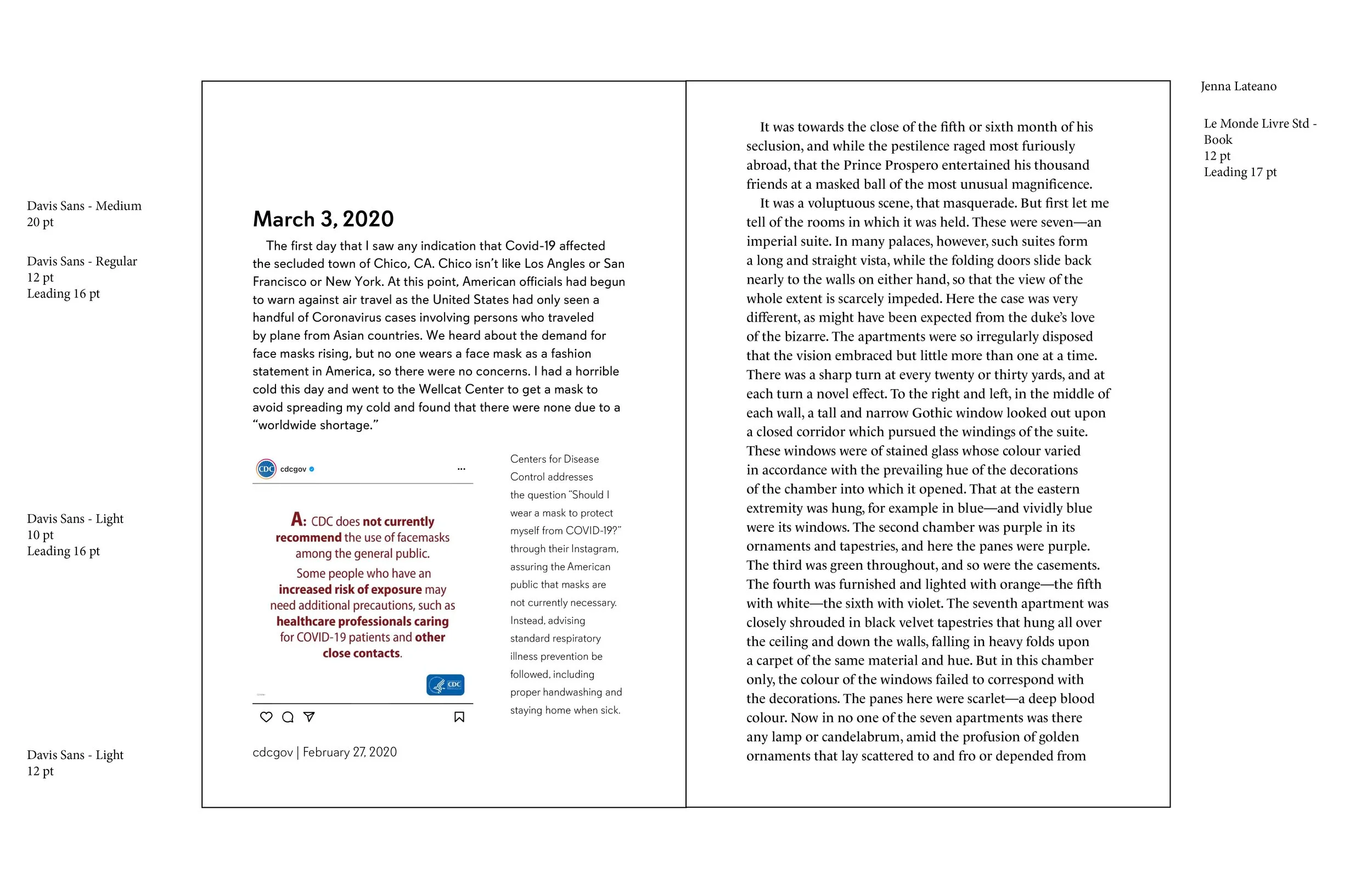
Davis Sans & Le Monde Livre
While liked the variety within the Davis Sans family the type didn’t feel as balanced as I wanted on the page when arranged against Le Monde Livre.
Line Length Exploration
-

Flush Left, Ragged Right
I knew I was going to have a lot of text that varied greatly in length so flush left was the best way to improve readability throughout the text.
-

Justified
Justified looked nice on larger bodies of text but had very poor readability on small text blurbs. I wanted to include short descriptions and explanations throughout the book so I knew justified wasn't going to be the best option.